Decades ago I was chatting with an artist acquaintance. He was a long-established professional, and I… wasn’t. We hadn’t met for some time, so he asked to see my latest work. I shyly showed him a piece – can’t remember what – and mumbled some excuse about why it wasn’t a better standard.
He fixed me with a gaze that could dry up Niagara Falls,
“Never apologise for your work.”
It was excellent advice, so this week I’m including it in my Advice Worth Spreading series.
Why are we so uncomfortable accepting compliments about our art?
I suspect this is mostly a British thing. Or a woman thing. Or both. But it’s something I’ve noticed on numerous occasions.
Maybe you have too. How often have you complimented someone’s art, and then heard these types of comments:
I’m just a beginner
I know it’s not perfect, but…
I’m pleased with it, except for this part
It’s not really finished
It didn’t turn out how I planned
I didn’t have as much time as I needed
Why ever do we do that?
You don’t hear it in other professions. No engineer tells you their bridge could be better. A surgeon doesn’t say they were quite pleased with the operation, but their stitching could have been neater. We’d think them insane.
So let’s stop the self-sabotage.
Shuffling awkwardly, avoiding eye contact and making an excuse makes both parties uncomfortable.
Someone who previously liked your work enough to make their feelings known to you, now feels less good about it. The opposite effect you wanted.
I’m sure it’s a (lack of) confidence thing. So a few points to remember:
Your creative work has value. It may, or may not, be perfect. That’s irrelevant. You produced something through interpretation, skill, time and energy. Never apologise for that. It has value.
Your work is the best you can do for the standard you’ve reached. A beginner’s best work won’t be the same standard as a professional’s best, but both will have applied themselves to the best of their ability. Don’t denigrate your best efforts, celebrate them. Shout it from the rooftops, that you created something and you’re proud.
If your work really isn’t finished, or you can’t bring yourself to say anything good about it, don’t show it. Smile sweetly and say, “Next time. It’s not ready to make its public debut yet.”. Then show them something else that you can be positive about.
When someone pays your art a compliment, they are giving you a gift. You may not be able to see the expensive gift-wrap or the enormous bow on top, but it’s a gift all the same. Accept it graciously, as you would a physical gift. You’ll feel good and they’ll feel good.
Big smile. “Thank you. I’m so glad you like it.” or a similar comment.
Then STOP.
Don’t add any of the aforementioned comments. Don’t deny either your skill or their pleasure in your work.
Alternatively, you could ask an open question, especially if you’re talking to a potential client:
Open questions are so much better than any that elicit yes/no answers and close the conversation down.
Are you a fan of… penguins/ oil paintings/ beaches/ abstracts/…?
Have you been to…. Antarctica/ New York/ Cornwall/ Australia (wherever the subject of your painting is)?
I was particularly pleased with this one because… What was it that spoke to you about it?
Congratulations, you’ve just initiated a conversation that builds a rapport with a potential client.
However they answer you’ll find out something about them and move the conversation on, possibly towards a sale.
Isn’t that a much better outcome than an apology would generate?
Note: Some affiliate links may be used in this post. I may receive a small commission, at no extra cost to you, if you use my affiliate link. Full disclosure policy here.
New product alert! I’m so impressed with this one I just have to share it with you.
It’s the mis-named Liquitex Pen Cleaner. Not entirely mis-named, as it does clean pens. But it also cleans other products, so calling it a pen cleaner perhaps limits its audience. So do read on, even if pens aren’t part of your creative practice. If you use acrylics you’ll want to know about this.
I bought this product ages ago when I was planning to do some airbrush work with my acrylic inks, but that didn’t happen so the cleaner has been sitting in my studio ever since, waiting for its moment.
The moment arrived!
Last week I was teaching at a summer school. (Hence the lack of last Friday’s blog post. Sorry.) I was demonstrating the use of a ruling pen and realised mine was looking past its best. It’s about 35 years old, and has been used for watercolour, gouache, acrylic and ink, so I don’t blame it for looking a little tired.
The blades weren’t heavily soiled, but they did show acrylic ink residue and staining, which had so far resisted my attempts to wipe clean.
I thought I’d give the pen cleaner a try.
Dunked the pen in the cleaner for a couple of minutes, gave it a wipe, and IT LOOKS LIKE NEW!
So easy, and no trace of paint left. You’d never know it’s decades old. I’m seriously impressed. And relieved. If my pen gets grubby in future, I know I can get it back to a pristine condition.
If you prefer a dip pen to a ruling pen, I’m sure it would work equally well.
Encouraged by my success, I thought I’d try cleaning my painting/palette knives. While I’m usually quite good at wiping my knives clean after each use, I still find that there can be a build up of paint around the base of the blade.
It’s important to keep blades clean, otherwise a beautiful swathe of colour can be ruined by a blob of hardened paint scoring a channel through the pristine paint.
Often you can solve this issue by leaving the metal part of the knife in water for an hour or two and then wiping away the paint. But for really encrusted paint, even that isn’t always sufficient.
Getting the cleaner to the necessary area was more of a challenge, as the mouth of the bottle is too small to fit a knife and I didn’t want to waste lots of cleaner by decanting more than needed for the job. The knife blade didn’t fit any of the my small containers, and using larger ones would have required too much cleaner.
My eventual idea was to use a pipette to flood the paint-covered area with cleaner. As the encrusted paint had been building up for months (or years?), this time I left the cleaner in place for half an hour.
As you can see this worked well. Much of the encrusted paint was easy to wipe away. I used a cocktail stick to work away the remaining paint from the area where the handle joins the blade.
I didn’t have time to work on it further today, but I’m sure another go would leave the knife in an almost pristine condition. As this is my favourite knife, I’m very glad to see it looking clean again.
As a pen cleaner, it’s designed to remove paint from metal surfaces. That means you can spruce up your brush ferrules too, but better still this cleaner works on nylon too.
That means it will soften a brush that’s solid with hardened paint. Yes I know we should always clean brushes as soon as we’ve finished using them, but sometimes distractions happen and we only realise when it’s too late. The Pen Cleaner laughed at hardened paint and the bristles were soft again in minutes.
My verdict
I was very impressed by Liquitex Pen Cleaner. It worked well on metal surfaces on both stained and encrusted acrylic paint. I’ve yet to try it in my airbrush, but I see no reason why it wouldn’t work equally well.
The speed at which it softened a paint-encrusted brush was a revelation.
At around £17 for 150ml it’s not a cheap product, but as I needed very little to get good results it’s actually quite good value for money. It’s currently on offer at just over £11, so even better value. (Prices may have changed since the time of writing.)
For those of us that have well-used tools that show more acrylic paint than ideal, this could be a game-changer. I’m very happy to recommend it to you.
Note: Some affiliate links may be used in this post. I may receive a small commission, at no extra cost to you, if you use my affiliate link. Full disclosure policy here.
I feel irked. Irritated. Frustrated.
Buying art materials doesn’t usually make me feel this way. Buying art materials usually makes me happy. Even euphoric, on some occasions.
Yesterday was not one of those days.
It started well enough. A trip round four stores to buy art materials for my acrylics class next week. I’m lucky to have so many options within 10 miles of my home.
Then came my final purchase: small canvasboards, 4×5 inches at 50p and 5×7 inches at 80p. I don’t usually work on canvasboard but, as it is ready primed and inexpensive, I felt it would be a good option for my students to use for a particular project.
Here’s the label. All the characteristics I want in a canvasboard panel. Note the one highlighted in red.
There weren’t enough pieces available on the shelves, so I asked the assistant for more. It’s a warehouse, so they usually have masses more of everything out back.
“We’re out of stock”, she said. “And I’m afraid the price has gone up on the next batch. They’ll be 95p and £1.10.”
Now I do understand that prices are rising on almost everything. I know that retailers are absorbing some costs and passing on others. That in itself wasn’t what irked me, though an item almost doubling in price overnight certainly wasn’t pleasing.
What made me mad was another change they’d made. Here’s a screenshot from their website. Spot the difference.
So in addition to the price rise, they have changed the base material from MDF to compressed cardboard. I don’t want cardboard, I want MDF. That’s why I’d chosen that particular brand in the first place.
So a massive price rise for an inferior product that won’t match my previous purchase. Triple whammy. Grrrr!
To make things worse, when I checked online later, I couldn’t find any brand that is using MDF. It seems that the product I want is no longer available at all.
So I thought I’d share this cautionary tale with you. Always check the specs of whatever you are buying, as it may have changed since the last time you bought it. Especially in these days when retailers are trying to cut costs.
That could mean finding an alternative brand that is what you want or, as in this case, it could mean having to accept that the product you prefer is no longer available and an alternative must be found.
Either way, I believe it’s important that we know the products that we are using. We’ve deliberately chosen then to suit our work and we can trust their integrity.
I’m going back to using MDF that I cut and prime myself.
Rant over.
Happy painting!
Related posts
With prices rising on almost everything, it helps to be conscious of where we can save money and work in a more sustainable way. If you haven’t already seen it, do check out my recent series on how artists can save money and the planet while continuing their art practice.
Note: Some affiliate links may be used in this post. I may receive a small commission, at no extra cost to you, if you use my affiliate link. Full disclosure policy here.
Black: it’s a Marmite colour.
No, I don’t means it’s dark (duh!), I mean people tend to love it or hate it in a painting.
But is the issue really so black and white?
Why should we have to choose a definitive use or avoid? Surely there’s a grey area?
What’s wrong with black in a painting?
There’s nothing inherently wrong with black paint. It’s just as lightfast as other colours, is equally compatible with other acrylics, and is just as permanent as others in the range.
So why do so many artists hate it?
Some artists don’t like it because it’s too heavy and dominant. Colours are seen when we view particular wavelengths of light, whereas black is an absence of light. It’s fundamentally different than other colours in the palette.
Black can be a little dead-looking – it doesn’t have the luminous depth of other dark colours. When mixed with other colours it can make the mix look dull or muddy.
The Impressionists are famously said to have refused to use black at all (though Manet, Degas and Cassatt certainly did). Yet before Impressionism black was a staple colour in the artist’s palette.
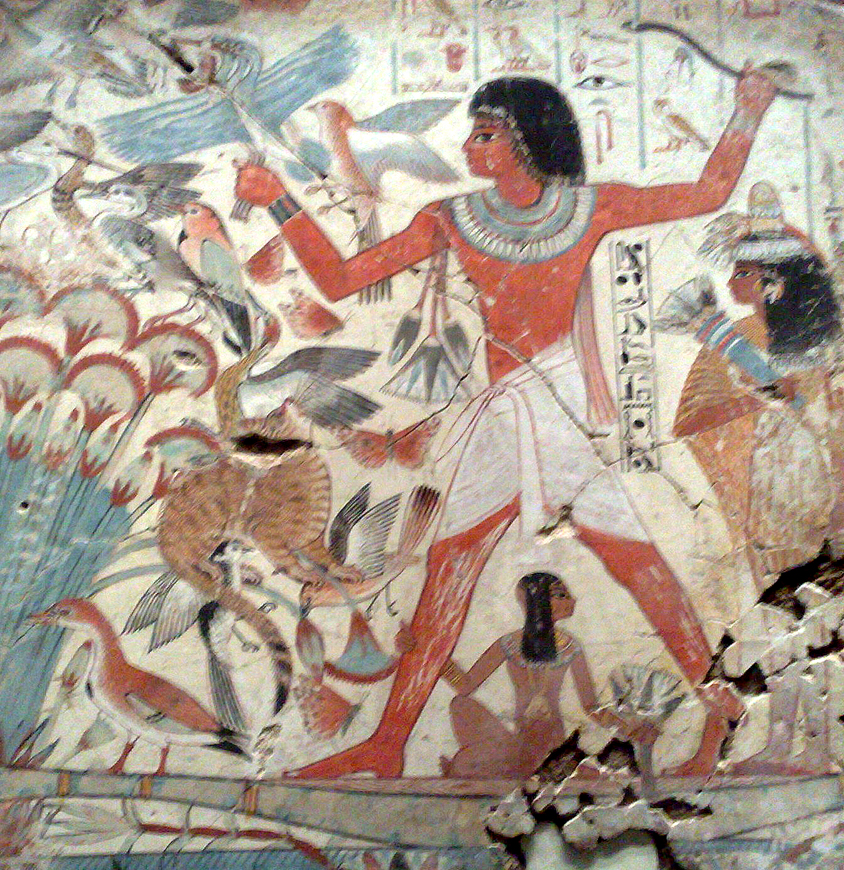
Other cultures have no inhibitions about black. It’s been used in Egyptian and Chinese paintings for millennia and was key in the cave painter’s palette.
What can we use instead of black?
A very dark colour akin to black can be mixed from the three primaries: yellow, blue and red. The resulting colour will vary slightly, depending on the proportions of each colour used.
Students in one of my teaching groups made an interesting discovery, that it didn’t matter much which three primaries were chosen. The resulting colours were quite similar.
Cadmium Red, Cadmium Yellow and Primary Blue produced much the same result as Primary Red, Lemon Yellow and Ultramarine. So whatever your palette, if it contains three primaries, you’ll be able to mix black.
As you’ll have used those colours elsewhere in your painting, the resulting dark colour will fit with the rest of the painting.
The great advantage of mixing your blacks is that you can adjust the darks towards warm brown or cool blue.
I often use a Burnt Umber, or Burnt Sienna, and Ultramarine combination.You can see the effect of adding one to the other here.
While we’re on the subject of colour mixing, I must stress that black with white is the worst combination if you want to mix grey. It gives a horrid, flat, boring colour. Instead try these:
Crimson + Viridian
Phthalo Blue + Cadmium Red
Ultramarine + Unbleached Titanium
Any of those give beautiful greys, full of depth and interest.
When black is best
Sometimes we may want the drama of black. I tend to use it in abstracts, when I want the play of colour or metallic paint against black.
Years ago I went to a workshop where we made lino prints in black over neon colours. The effect was fantastic – bold, dramatic and unusual.
Black ink with washes of watercolour is a traditional technique, that gives pleasing results. Few would say that black should not be used.
This is Gloss Medium applied with a painting knife over a piece of black card.
Using a clear gloss (liquid or gel) over black deepens and intensifies the darkness.
Black is also perfect for maximising the effect of interference colours, as we saw in last week’s post.
When colour mixing, black added to a colour produces shades. (Add white to make tints, and grey to make tones).
Black creates interesting mixes, especially when added to yellow. As black often has a blueish hint, its combination with yellow produces subtle greens. Some blacks have more blue than others, so it’s worth experimenting with different types and brands.
Types of black
To give yourself a better idea of the characteristics of a particular brand’s colour, remember to check the specification on the stockist’s website. They should state whether the paint is opaque, semi-opaque or translucent, or transparent. They’ll also include the Pigment Colour Index (anything black is PBk followed by a number that denotes the pigment).
For those who want to include black in their palettes, there are quite a few to choose from. Not all blacks are created equal, so here are the characteristics of a few of the most common.
Mars Black – PBk11, warm. Opaque
Carbon Black – PBk7, warm to cool. Translucent to opaque
Ivory or Bone Black – PBk9, warm. Translucent
Lamp Black – PBk6, neutral to cool. Translucent to opaque
Iridescent Black – a shinier version. Can be achieved by adding iridescent medium to one of the standard blacks.
Pearlescent Black – metallic, but a muted shine
Like any colours, black will vary slightly from brand to brand. Lamp Black, for example, may be neutral and translucent in one brand to cooler and more opaque in another.
If you’re still not sure you can purchase a hand-painted colour chart, which shows the exact colour rather than a printed or digital approximation.
In conclusion
Black – it has its own characteristics and advantages, so deserves its place on our palette. Like any other art material, we should use it through considered choice, because it’s the best option for that particular piece.
It’s not the best choice every time, but neither is it always the black-hearted villain of the paint chart. Blanket decisions that give no room for manoeuvre are rarely the best option.
You could say that the decision to use black is not always as black as it’s painted.
Note: Some affiliate links may be used in this post. I may receive a small commission, at no extra cost to you, if you use my affiliate link. Full disclosure policy here.
I’m so excited! I’ve just made a new paint discovery, and I have to share it with you.
I’ve discovered interference colours.
(Note: I’ve also discovered that interference colours are impossible to photograph in a way that does justice to their beauty. Please multiply the photos in this post by a factor of 10 on the gorgeousness scale.)
To be absolutely accurate, it’s not a completely new discovery. I already knew about shimmering/ interference colours in acrylic inks.
But these are Golden’s Interference colours, which are available in Heavy Body and Fluid colour (Fluid is akin to Soft Body). Sometimes thicker paint is more appropriate than the liquid acrylic ink.
What’s so special about them?
Interference colours are different from other acrylics because their appearance changes depending on the angle of view. From one angle they can look transparent, with barely any colour visible; from another angle they appear bright opalescent colour.
FW’s Shimmering colours are interference colours with a different name. Shimmering Gold over pink is barely noticeable from some angles, but shines brightly from others.
Over a pale colour they have a fait sheen of colour. Over dark, they shine brightly. You can increase the opalescence by adding just 1% Mars Black. 2-5% black produces iridescent greys.
How does this switch from transparent to opalescent happen? At this point I wish I’d paid more attention in physics classes, but my best explanation is this:
Imagine if you took a tube of transparent paint, removed the pigment and replaced it with titanium coated mica flakes. You now have a tube of interference colour.
Some of the light hitting the paint hits the mica flakes directly, and bounces off, whereas some passes through to another layer and bounces off at a different refractive index. Hence there are two different wavelengths, so two different appearances.
What is the colour range?
Heavy Body interference colours are available in:
Gold
Orange
Red
Violet
Blue
Green
Fluid colours are available in all of the above, with the addition of:
Green-blue
Violet-green
Green-orange
Jackson’s Art Supplies helpfully offer a hand-painted colour chart specific to interference colours. I’m a big fan of colour charts, especially when you’re ordering online and can’t see the actual product.
Colours can be blended together to produce new colours without the loss of the interference effect.
When laid over each other there’s just a hint of the underlying colour.
My only bugbear is that the colour I particularly wanted was Green-blue, and that was hard to find. Most shops either didn’t stock interference colours at all, or only stocked a limited range.
Jackson’s Art Supplies sells Heavy Body and Fluid in the standard colours, but doesn’t sell the additional Fluid colours. I eventually tracked the additional colours down to Cowling and Wilcox.
How can we use interference colours?
I realise that if you’re only painting traditional realism, these probably won’t be your most useful colours. Yet for the right application, they’re perfect.
I’m currently taking inspiration from minerals and gemstones, like these Kyanite and Peacock Ore specimens. Interference paints are exactly what I need to produce the sparkle and iridescence.
I haven’t used them for seascapes yet, but I can imagine they’d be great for giving sparkle to water and breaking waves. Just use with restraint, or they could take over the image.
Interference colours are ideal for abstract art, or anything where you need a bright flash of colour. I particularly like the way the image changes as I move around it.
I daubed Interference Red, Violet, Blue and Blue-green randomly over a dark purple, bubbly surface.
The effect was glorious iridescence, a little like an oil film on water. I’m looking forward to using this in mixed media work.
What about the sizes?
There are several sizes to choose from. Heavy Body is available in 59ml, 150ml, 237ml. Fluid colour is available in 30ml, 119ml and 473ml.
I’m in! How much do they cost?
These are not cheap paints. They’re price series 7, so the among the most expensive of Golden’s range. I nearly fainted when I found a tub of Green-blue at £76 (eek!), but thankfully that’s far more than I needed. I managed to find a small bottle for just under £10.
Heavy body tubes start at around £15 for 59ml. £30 for 150ml and £43 for 237ml.
Fluid colour is £10 for 30ml, £27 for 119ml, £76 for 473ml.
While they’re at the higher end of the price spectrum, they’re relatively cost effective, as you probably won’t need a lot of paint per painting. They’re best used sparingly over a surface of standard acrylic colours. Too much would be overkill.
My Verdict
There’s no doubt in my mind that these are superb quality paints that will give a lift to an appropriate painting. Pricy, yes, but well worth the money because they produce an effect that other paints can’t recreate.
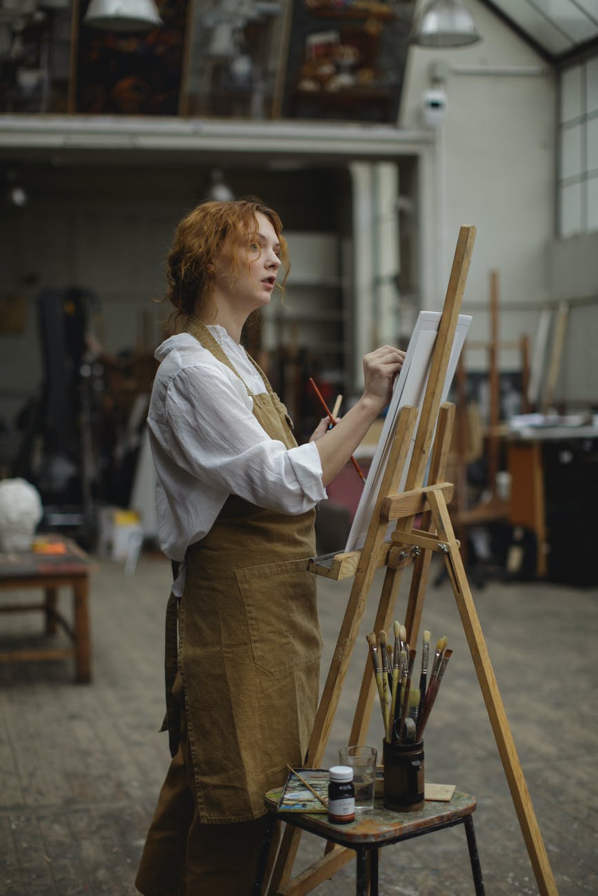
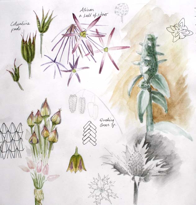
This week we’re considering the relative positions of artist, support and subject.
Where are you sitting (or standing) to sketch?
This seems a trivial question, but it’s important to choose the optimum vantage point. Why would we make sketching more difficult, by disregarding something so easy to control?
If you think the position doesn’t matter, consider this.
If I asked you to sketch something large (elephant/ steam train/ cathedral…) and then asked you to sketch something small (insect/ flower/ slice of cake….), would you choose to sit at the same distance from each one?
Of course not!
You’d choose an appropriate distance, so you can see all of your subject without having to move your gaze.
I was reminded of this during a recent life drawing class.
The poses changed, and sometimes I asked the students to concentrate on the whole figure or sometimes just a part. Yet most acted as though their chairs were fixed in place. Even when I reminded them to consider their positions, there was still reluctance to move.
Yet drawing just the hands vs the whole figure, should require different drawing positions.
What is the ideal distance from your subject?
Sit too close and you’ll have a distorted view. You can’t see all of your subject without turning your head, so that means you’ll be drawing from two different viewpoints. Not good, unless it’s a deliberate creative choice.
Sit too far away and you can’t see enough of the structure, subtleties of tone, or details.
So the ideal position is the sweet spot between far enough to see the whole of your subject, but close enough to have a good view. Obviously the exact distance depends on your the size of your subject.
“Where should I sit for portraiture”?
Excellent question. I’m so glad you asked.
Imagine you are painting a full length or three-quarter length portrait. Clearly you need to sit or stand far enough away to see the whole figure, but that means it will be harder to see the details of the features.
The answer is that you change your position as the painting progresses. The initial stage would be establishing the structure, tones and perhaps colours of the painting. You’ll likely sit several metres away.
Then you might move closer to establish the textures, make corrections and continue to refine the painting.
Finally you would move very close to enable you to see the details of the features.
This process naturally means the features will end up with the most detail, which will demand the viewers’ attention. Exactly what we want. (Viewers always concentrate on areas of contrast or detail in a painting.)
Alternatively, you could keep the painting in the original position, but regularly move yourself forward for a closer view.
What is Sight Size?
While we’re on the subject of your position in relation to your subject, and especially portraiture, we should also talk about Sight Size.
On the whole, we tend to set our support close to the artist rather than to the subject. Sight Size is different – the support is placed alongside the subject, and the artist stands further away.
The artist moves to the painting to make a stroke, then retreats to their original position to consider the next strokes or alterations. The painting is the same size as the subject, which should be copied as closely as possible.
An example of sight size work is in the excellent TV programme, The People’s Portrait, of Nicky Philipps’ painting Simon Weston for the National Portrait Gallery. You can see it on YouTube here. (The explanation of Sight Size is at 8.12). Note how she has put tape on the floor so she always returns to the same position.
When we work in sight size, we are usually standing, so we can move freely to and from our work. The artist’s viewing position needs to allow them to have a good view of both the sitter and the work together.
What else should I know about positioning?
Standing at an easel to sketch or paint has another advantage.
I know I’m much more likely to move closer to my subject, to get a better view, or step back to review my work, than if I’m sitting.
We don’t view work at the same distance as we create it. Stepping back from time to time, to see how the work looks from the normal viewing distance, is really important.
Tonal relationships look different according to the distance at which they are viewed.
We also need to choose our position, relative to the subject, so that we have an interesting view. That’s not so much about the distance from your subject, but rather the angle of view. It could mean rearranging the subject or pose, or moving yourself so the view is more interesting.
Aside from the obvious viewpoint, what would be the effect of looking at the subject from a particularly high or low viewpoint? Or from one side, or the back?
Never just take the most obvious view without giving the image some thought. The first idea may be the most interesting, but we’ll only know that after we’ve explored other views.
Something as simple as the artist’s position may seem trivial, but it’s something we should always consider when preparing to draw or paint.
How many times have we said that? More significantly, we’ve most likely said it as though it’s a negative.
Arty variations include:
I would love to paint, but I don’t have time
I could have done more preparation for the painting, but I didn’t have time
I should produce more paintings, but I don’t have time
Woulda, coulda, shoulda. The holy trinity of regret.
But what if not having as much time as you wanted was not bad, but good?
This is the third of Advice Worth Spreading, my infrequent series of great advice I’ve heard from other creatives.
This time the advice was “Time is your enemy.” The occasion was many years ago. At that time my drawings were good enough to receive compliments, but there was certainly room for improvement.
An arty acquaintance was viewing my sketchbook. “Hmm”, he said, “Time is your enemy”.
He was right. Many of my drawings were overworked. I was subconsciously trying to make them perfect, so I kept going, beyond the point at which I should have known they were finished.
Unlimited time allows us to overwork. There’s no need to declare the drawing finished. The drawing lacks life. Dynamic lines becomes lacklustre, if we keep reviewing and fiddling with minor changes that only we will notice.
Unlimited time removes urgency. I’ll paint tomorrow/ next week/ whenever. Time is indeed the enemy.
Have a time limit or need to meet a deadline? A single line will speak volumes. You’ll dive into the painting and get it finished. The brushstrokes will have energy and vigour.
Parkinson’s Law states that work expands to fill the time allotted for its completion. I’ve visited art clubs where participants want to go home with a finished painting. If it’s finished earlier, they’ll fiddle with it until it’s time to pack up, sometimes to the painting’s detriment. Time is again the enemy.
You can say as much in two minutes as two hours
Some years ago, I was fortunate to be able to take a life drawing class with Allan Laycock RWA. Allan was primarily a landscape artist, but had extensive experience in many aspects of art and design. See his gorgeous work here.
We’d started drawing, but after a couple of minutes Allan announced. “Times up”. Consternation! None of us felt we’d had enough time. “I gave you two minutes”, Allan said. “If I’d given you two hours, would your drawings have said much more?”
He was right. We’d caught the spirit of the pose, indicated the proportions, maybe added a little shading. Time would have allowed some refinement, but much of it would have been spent reiterating what had already been said or just adding surface details. It was a good lesson.
I can’t remember how much time was allowed for this post, but it was relatively short.
Would I have said much more with double the time? Probably not.
Lack of time means we work fast
If you’ve ever attended a life drawing class, you’ll know that the session often starts with a series of short poses. There are two reasons for that.
Firstly it’s a good way to warm up. Students start drawing quickly, without having time to worry about details or achieving perfection.
Secondly, it makes us draw fast. If you know you only have a few minutes, you’ll draw much quicker from the outset than if you know you have hours.
If you keep drawing at the speed of a two-minute pose, when you have fifteen minutes you’ll be able to achieve much more than if you’d gone straight into a fifteen minute pose.
This was a fifteen minute pastel drawing.
We’d already made five and ten minute drawings, so I was drawing fast.
No time to overthink it, just steam into it and get as much done in the time as possible.
Would I normally expect this to have taken much longer? Certainly.
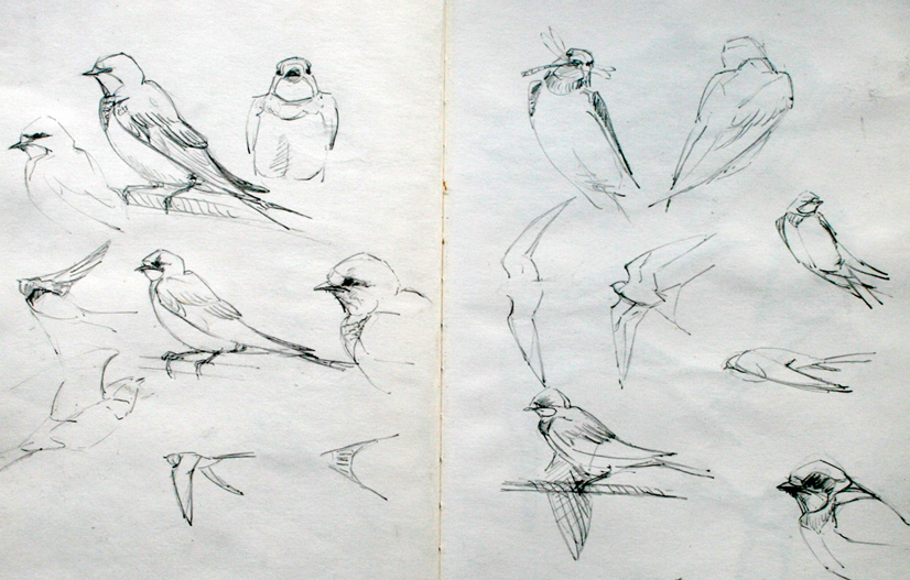
One of the reasons I like drawing birds is that I’m always conscious of the need to draw quickly. Poses change in a flash, and the likelihood is that my subject won’t be around for long. The ultimate in time limitation!
Consequently a single line must be employed instead of several, but that line has variation and energy. An unfinished drawing will convey much information, even if part of the bird has been omitted.
Prioritise
What about “I don’t have time to draw/ paint?
We may use this as an excuse for not drawing, but that’s a myth. A drawing might only take a few minutes, and we can all find time for that if we want to. True, a large oil painting will take significant blocks of time, but a line and wash sketch is perfectly possible even if you only have a short time.
We can all make time for what is most important to us. When I had a full-time job, I used to draw for an hour before work. I’m certainly not naturally an early riser, but improving my drawing skills was more important to me than a lie-in.
A friend in full-time employment drew in his lunch hour at work each day when he was preparing for an exhibition. Fortunately he worked in coloured pencils. Oils would have been more of a challenge.
Another sketched his mug, a water jug or a chair while he was waiting for colleagues to arrive for a staff meeting.
I wanted to attend a full day portrait class, but couldn’t due to another commitment.
Could I have said “I don’t have time” and missed the class? Of course. Instead I attended the last two hours. Something was better than nothing.
Limited time meant I was fully focused on getting as much done in the time as possible. Working small and being impressionistic instead of detailed helped offset the time limitations.
So next time you say you don’t have enough time for your art, grab your art materials and get going anyway. And be thankful, because time is your enemy.
Note: Stats in this post come from the “Museums – Taking Part Survey 2019/20” on the UK government website.
There’s a single word that brings delight or horror to most people. If I said it to you, you’d probably have one of these reactions.
Yawn: old, dusty, dingy,boooriiiing. Shoot me now!
Awesome: fascinating, expertise, discovery, inspiring. When can we go?
The word is, of course:
Museum
I believe that museums are an under-utilised resource available to every artist. It offers many benefits, may be accessed online or in person and is, in many cases, free.
So, boring or awesome? You may have guessed that I’m in the latter camp. If you’re in the former, may I encourage you to think again?
In the interest of full disclosure, I confess I may be a little biased. I used to work in my county’s museum service and spent over a decade working in an art museum. So I’m fully aware of the “old and boring” reputation that is often levelled at all museums, even though the overwhelming majority don’t deserve it.
But I contend that museums are fantastic places, especially for creatives. Have you ever considered how they might aid your practice?
Opportunities for inspiration? Check.
Exhibition space? Check
New audience? Check
Sales opportunities? Check
Workshop or residency opportunities? Check
Collaborative working? Check
Let’s take a look at those in turn.
Inspiration
Whatever your medium and style of work, there’s a museum that can provide you with inspiration. Art, military history, textiles, crime, railways, local history, aviation, natural history, Romans and waterways are just a few of the subjects covered by museums just in my county.
Add to that the national and international museums, and there’s a world of inspiration out there waiting to be explored. These days many museums have digitised much of their collections, so there’s more opportunity than ever to discover work in other countries.
Whether you are well-versed in your subject, or a newbie, you’re sure to learn more about your subject through museum collections.
Insider tip: museum staff absolutely love visitors who are really interested in the museum’s subject. Get to know the staff and it’s likely they’ll go out of their way to help you get the most from your visit.
While working on a project investigating wildlife species depicted in ancient Egyptian art, museum collections gave me opportunities to study genuine artefacts in my home country and overseas.
While some of my work was to be used for illustrations, I was also free to follow wherever my inspiration led.
I’d never taken my creative inspiration from art of other cultures and eras before, so this took me on a fascinating journey.
Obviously it depends on the size of the museum, but there should be plenty to inspire. I’m sure I could happily have spent months in The Met.
Exhibitions
There are two ways to benefit from museum exhibitions: either by taking inspiration from the collection, or by the museum hosting your own exhibition.
Regular readers will recall that I was blown away by the kiln cast glass exhibition showcased at my local museum. This was an international quality exhibition, hosted by a small town museum. We may not need to travel far to see top quality art.
Exhibitions can be part of your professional development. Copying great artists’ work for your own learning is a tradition that dates back centuries and used to be part of an artist’s training.
(Note; you can’t exhibit or sell your own copies of copyrighted work. See my previous post on the basics of copyright.)
Most museums aren’t keen on artists painting in their galleries, except by prior arrangement, but are quite happy for artists to used dry media on any visit.
Most museums are keen to change their displays regularly. A temporary exhibition programme keeps the museum experience fresh for repeat visitors and attracts new audiences interested in that particular subject.
So don’t be afraid to approach them with an exhibition proposal. If you paint railway history, where better to display your art than at a railway museum? The majority of visitors will be there because they are passionate about trains too.
It works for both parties. The artist benefits, but if your art has a clear link with the museum collection, and will enhance the visitor experience, the museum benefits too. The best business relationships are a win for all parties.
Which leads us nicely on to:
New audience
When thinking about where to display your work, you might not consider museums to be full of potential buyers. Yet let’s think more about that.
Typical museum visitors are educated to higher managerial, administrative and professional level, and thus likely to be employed in jobs that give above average income. The age range of museum visitors is mostly 25-75, the prime ages for buying artwork for a new home or having more disposable income once the offspring have left home.
So by exhibiting at a museum, the artist gains a mostly new audience that are well educated, likely to have above average wealth and are passionate about the subject. I don’t know about you, but I’d jump through hoops of fire for a new audience like that at my next exhibition.
My local museum has a lovingly-restored, walled garden. It’s currently a riot of colour, shape – quite an assault on the senses! I spent a very happy afternoon there yesterday exploring pattern and structure in plants.
I know outdoor sketching isn’t for everyone, but when we do so we invariably end up talking to other visitors.
Pass over a business card and they’re likely to check out your website later. So you’ve made a new contact from someone who is interested in the same subject. Keep in touch – who knows where that casual conversation may lead?
Sales opportunities
My local museum’s shop is a treasure trove of work by local artists. It’s only a small part of the entrance hall, but there are greetings cards, ceramics, textiles, notebooks, jewellery and books on display.
I’m sure each artist is only able to display a small part of their range, but even a few pieces entice visitors to discover more of that artist’s work.
Again, visitors are likely to be interested in the subject, and quite likely to be on holiday too. What do many people do on holiday? They buy souvenirs to remind them of their experiences. Haven’t we all factored in “spending money” when planning a trip? Holidaymakers are more likely to make an impulse purchase, whether it’s a simple greetings card or a more substantial piece.
Better still, merchandise is being sold while the artist is working elsewhere, effectively increasing their income beyond the £ per hour business model.
Workshops, talks and residency opportunities
For many artists, teaching via workshops, talks and demonstrations is an important part of their practice. Again, museums have their part to play. Most offer a programme of talks and special events, so will always be on the lookout for new speakers.
If you are able to exhibit with the museum, a “Meet the Artist” type of event, or a lecture, are ideal ways to help viewers to engage with your art. Many museums have dedicated spaces for delivering educational events, so if a lecture’s not your thing, a workshop may be possible instead.
Insider tip: constantly finding new speakers can be a headache for museum staff, so if your art relates to a particular aspect of their collection they’re likely to welcome you with open arms. Even better if you can offer something unique or different from their usual fare.
Linking with (inter)national awareness days/ months/ years can work well too, as it creates a hook for your event and opens up new marketing possibilities. Whether your art is about oceans, food, human rights, forests, women’s health, astronomy… there’s almost certainly a day that highlights it.
Collaborative working
When I worked in a museum, we often encouraged collaboration. Perhaps two artists painting together during a residency, or an exhibition of art with poetry or music. We linked artists with our school’s programme, and hosted exhibitions of work where a group of artists had collectively responded to a particular environment. There were numerous partnerships with other organisations.
Not least, there’s the collaboration between the museum curatorial staff and the artist. Experts love nothing better than sharing their passion for a subject with like-minded individuals. Both parties have an opportunity for new awareness, and both may find their work is enhanced by the experience.
Collaboration gives artists the chance to create work that is stronger and more unusual than work produced by themselves alone. With a combination of inspiration and expertise on hand, museums provide a fertile ground for sowing those seeds.
I hope this post has given you a new appreciation of how artists and museums can benefit each other. There are so many options it’s worth brainstorming some future possibilities and making contact. At the very least, do check out your local museums. There’s probably more going on there than you’d realised.
Note: Some affiliate links may be used in this post. I may receive a small commission, at no extra cost to you, if you use my affiliate link. Full disclosure policy here.
What is your favourite colour?
An artist friend once answered that with “Whatever colour I’ve just run out of!”.
What’s your answer?
Maybe it’s a yellow the colour of sunshine and buttercups; the delicate pink of an orchid; a vibrant green that speaks of the first pristine Beech leaves or Kiwi fruits dripping with juice. Colours give us instant recall of an emotion, a time or a place.
I was asked that question during a painting demonstration recently. I don’t really have a favourite, as I like so many it’s impossible to choose, but it’s definitely not pink. Never pink. Ugh.
I responded with “Whichever one I’m painting with in the moment.”.
It sounds a bit glib, but it is true. I respond to colours in the moment. I love that beautiful turquoise sea colour when I see it around the Cornish coasts. The rich electric purple of a piece of Chalcedony I bought last week gave me a visceral reaction. And I adore the vibrant orange silk of one of my cushions. And I feel on top of the world every time I wear my chartreuse coat. And… I could go on… and on. So many gorgeous colours; so many emotions; so little time.
But there isn’t one that trumps the others.
That said, I’ve just added a new colour to my paintbox that’s a definite candidate for “favourite” if I really had to choose a single one.
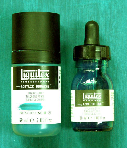
With that in mind. may I introduce to you:
Liquitex’s Turquoise Deep
What a glorious colour this is. (Much richer and luminous in reality, but I’m afraid my Photoshop skills aren’t up to showing it in all its glory.)
I first discovered it in Acrylic Ink as a tiny bottle that was part of a sample set. I liked it so much I bought the full size bottle, I’ve just added it in Acrylic Gouache and am considering the Heavy Body too.
(Update: yes, I bought the Heavy Body too. Of course I did. Did you ever doubt?)
I primarily wanted Soft Body, but alas it’s not made in that format. Acrylic Gouache is a similar consistency, so that was my substitute. (What is acrylic gouache?) Sadly, neither does it exist as a spray, nor a marker, or I’m sure I’d be tempted by those too.
Oh well, that’s good for my bank balance if not for my art!
The only issue I have is that it’s such a beautiful colour it’s tempting to overuse it! Even if you do, it isn’t such a strong colour that it would dominate in the same way as Phthalo Blue.
Characteristics of Turquoise Deep
Coverage: Heavy Body is Semi-opaque, Acrylic Gouache is Opaque, Acrylic Ink is Transparent. Great that I can choose the level of transparency I need.
Lightfastness: excellent in each format
Price: £5.00 – £7.80, depending which type you choose (prices may have changed since I wrote this.)
Another useful point is that it’s Series 2, whereas Cobalt Teal and Cobalt Turquoise are both Series 4. That makes them double the price of Turquoise Deep. (Anything Cobalt is always at the expensive end of the range.) Good to know if you’re on a budget.
Here’s my test sheet from my experiment sketchbook. It’s a really useful exercise to do whenever you add a new colour to your palette, giving a permanent reference of the new colours you can mix. (Note: the scan hasn’t shown the subtleties of each colour, but it gives you and idea of the results.)
The top line is neat Turquoise Deep.
I began my mixing exercise with Titanium White, adding a little more white each time to make tints. Then I repeated the process with Mars Black to make shades.
Then I went through two yellows, two reds and two blues and Yellow Ochre.
The final line was tints of Turquoise Deep and Primary Red.
Of course you can also make tints or shades of all of the above colours.
This was a very useful exercise, of which the most notable features were
Titanium White: the tints gave beautiful clear turquoises. Can’t wait to use them in my next seascape
Unbleached Titanium: wonderfully soft, muted versions of turquoise
Primary Yellow: created a luminous green-gold, perfect for sunlit foliage
Cadmium Red:excellent for creating rich reddish browns
Primary Red: subtle darks through burgundy to a rich but muted red
Ultramarine and Primary Blue: not surprisingly, the blues didn’t have a big effect, but they did create more complex blues, particularly in the mid-tones
Yellow Ochre: produces rich, warm greens, akin to Sap Green
Tints of the Turquoise Deep and Primary Red mix: soft, colourful greys, which would be wonderful for shadows. May be varied towards either warm mauves or cool blues.
Rich, colourful darks were easy to mix by using Turquoise Deep with Mars Black, Cadmium or Primary Red, or Ultramarine.
It’s not surprising that the Turquoise Deep/ Primary Red mix makes good darks. Turquoise contains a lot of blue and yellow, and by adding red we’re effectively mixing the three primaries, which gives black.
Although I bought this so I’d have a ready-made turquoise, it does so much more when mixed with other colours.
I’m greatly looking forward to using this versatile colour in future paintings.
Note: I’ve just received my weekly Jackson’s Art Supplies email, and this week they have acrylic paint on sale at around 15% off. I don’t know how long the sale lasts, but it’s usually about a week. No, I didn’t time this post to coincide with their sale, but if any of your acrylic paint supplies are running low, now is a good opportunity to take advantage of a discount.
A demonstration piece to show the effects of glazing.
At long last I’m finding that art societies are returning to in-person events. Much as I appreciate being able to communicate to a global audience over Zoom, I can’t deny that I prefer in-person talks, demonstrations and workshops. There’s less fear of the technology gremlins, better interaction between tutor and audience, and colours look better in real life than on camera.
With that in mind, I was pleased to be asked to spend a couple of sessions with the lovely people at Caerphilly Art Society. We’ve been exploring Glaze Medium, so I thought that the topic of glazing and scumbling would make a good blog post too.
What is the difference between glazing and scumbling?
Painting is not solely mixing colours on the palette and then applying them to the support. We can also modify an underlying colour by adding a new colour over the top of a dry layer. The effect will vary according to the relative coverage of the individual colour – whether it is transparent, translucent or opaque.
Glaze – a thin, even layer of transparent colour applied over part, or the whole, of the painting. Single or multiple layers can be used. Glazing looks best over a pale layer.
Velatura (pronounced vella-tora) – as above, but translucent colour is used.
Scumble – an opaque layer that partially hides the underlying colour. Usually light colour over a dark colour.
A good sketchbook exercise to explore glazing is to use two of each Primary colour and overlap them in stripes of colour vertically and horizontally.
Notice how the mixes have characteristics of both of their initial colours, creating shimmering, vibrant colours.
As an even layer of opaque colour would simply hide the underlying colour, scumbling involves broken colour i.e. applying the paint so as to leave spaces for the underlying colour to show through.
So scumbled colour may be applied sparingly with a brush, kitchen roll, rag or fingers. Alternatively, a thicker layer may be applied and then rubbed off with a cloth, so only a thin layer remains to modify the colour below.
As glazed colour relies on a thin, even layer of colour, it is usually applied with a brush.
Acrylics, oils or watercolours?
Choose any paint type (watercolour, acrylics and oils) and you’ll find that the range contains a mixture of transparent, translucent and opaque colours. Thus any of the three previously mentioned effects may be possible, but you’ll need to choose the colour with the correct level of transparency/opacity to achieve the effect you require.
So it’s vital to know the relative coverage of each of your colours. If the characteristics are not printed on the tube, refer to the manufacturers colour chart.
We tend to think of watercolours as a transparent medium, but certain colours are opaque. Just looking at a single range (Winsor and Newton, professional), any of the cadmiums (including cadmium-free), Naples Yellow, Light Red/ Venetian Red, Chromium Oxide, Sepia, Indigo and all of the blacks are opaque.
So scumbling techniques are possible with watercolour, but care must be taken to avoid disturbing the underlying layer.
As oils and acrylics are permanent when dry, the artist may glaze and scumble to their heart’s content without disturbing previous layers.
What is Glaze Medium?
Glaze medium is a specific product, usually a thick liquid, manufactured to aid glazing. (Not to be confused with Gloss Medium.) It increases the transparency and luminosity of the colour and dries to a thin, clear film. Think of it as bringing out the colour, in the same way that pebbles on a beach look more intensely coloured when wet.
Like other acrylic mediums, Glaze Medium looks milky when wet but dries clear. Like many other acrylic mediums, glaze medium looks milky when wet but dries clear. If you want to glaze with a secondary or tertiary colour, mix the desired colour first and then add glaze medium. It’s more difficult to judge the colour if you’ve added the milky-looking medium from the outset.
Glaze mediums are commercially available for oils too, or can be produced in the studio by adding two parts turpentine to one part linseed oil.
Simply mix a little of your medium with the paint. I mostly use an old soft, flat nylon brush, about an inch wide, to apply the glaze.
For this exercise I used the secondary colours of orange, purple and green.
Although each colour is applied in a very thin layer, when overlapped they create luminous darks which are far more interesting than using black or mixing colours on a palette.
What if you make a mistake when applying the glaze? No problem – the glaze may be removed while it is still wet. Simply use a clean rag, kitchen roll or brush to dab or brush away the unwanted colour. But once dry, like all acrylics, the glaze will be waterproof and permanent, so cannot then be removed. Mixing the glaze with a little retarding medium keeps the colour workable for longer.
Reasons to use Glaze Medium
Apply thin layers of colour over one another to build up depth of colour. The effect is similar to thin sheets of coloured cellophane overlapping each other. Each sheet modifies the appearance of those underneath.This is called optical mixing and the result is rich, intense darks that are far more interesting than colour mixed on a palette.
Use a thin glaze to alter the appearance of part of a painting. The colour you mixed doesn’t look great next to others on the painting? Rather than re-painting, use a glaze to modify the offending area.
Create interesting backgrounds for portraits or still-life paintings. Build up thin layers of colour to create depth and interest, without detracting from your subject.
Add a little Glaze Medium to thin washes of colour. Over dilution of paint leads to under-binding, whereby the paint’s binder is too weak to support the pigment properly. The paint layer is then easier to damage, may not dry evenly and will be very matte. Glaze Medium solves all these issues.
Warm or cool a colour. The rich chestnut colour you chose for the background is too dominant? Cool it down with a glaze of pale blue. That cool blue is too cold? Warm it up with a glaze of yellow.
Depict iridescence. Build up layers to create vibrant and rich colours.
Adding interest to backgrounds
Both glazing and scumbling are excellent ways to create interesting backgrounds. A single colour can look too flat and harsh. Modifying the colour creates an interesting surface in its own right, without being dominant enough to compete withe the subject matter.
Here are a few examples of how different scumbling techniques enhance the underlying colour. Vary the effect by changing the colour or increasing/decreasing the tone.
Top: (1) Flat colour (2) colour scrubbed over the surface with a brush (3) painting knife (4) darker and lighter tones blended with a brush
Bottom: (5) colour dabbed with a brush (6) scrunched kitchen roll dipped in paint (7) colour applied with a brush then lifted off with a paper napkin (8) colour sponged lightly.
Of course, more than one technique can be used to build depth and subtlety. Why not have a go? It’s fun and useful. Remember to write down your methods for future reference.
A scumbled background has more interest than flat colour, but doesn’t compete with the subject.
Vary the tone to direct the viewers’ attention. The eye always looks for contrast and detail, so here the viewer will look towards the front of the head rather than the bird’s back.
Glazing and scumbling are both useful techniques in your painting arsenal, so well worth mastering. If you’re not already familiar with them, I encourage you to explore their possibilities.